Salone del mobile 2026
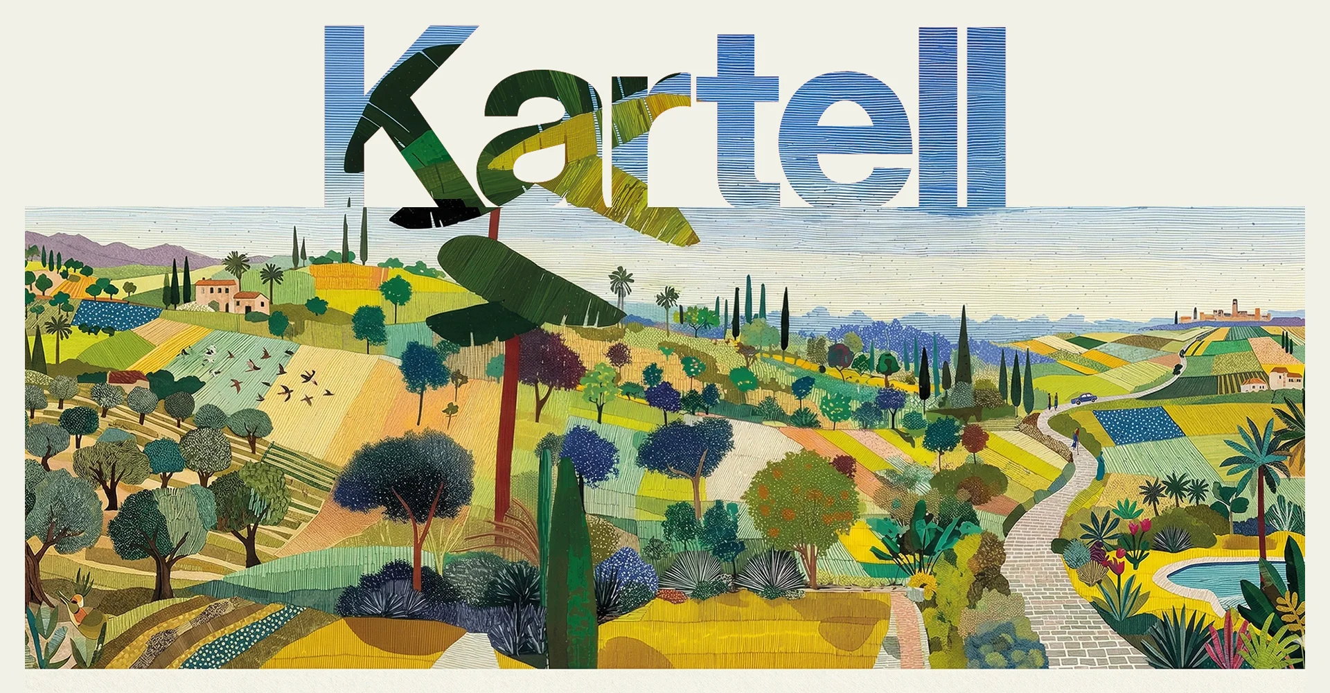
KARTELL
If red is the hallmark, the color of the logo that has always represented Kartell, white is its page: the one on which a new chapter is written every year. It is the journey between one Salone and the next, a path made of research, experimentation, and milestones to be shared. White is not a limit: it is the sum of all colors, the synthesis of cultures, viewpoints, and design sensibilities that take shape in the Kartell catalogue. It is an open space where ideas can meet freely, allowing the brand to be everywhere, with everyone, without boundaries. In this process, the dialogue between analog and digital becomes increasingly subtle: the mark, the gesture, and the material intertwine with the possibilities offered by artificial intelligence, which becomes a tool capable of translating these visions into images and stories, maintaining a unique narrative for each product. It is precisely from this blank page that the story of the stand at Salone del Mobile 2026 takes shape.
Materia.
New materials shape elegance
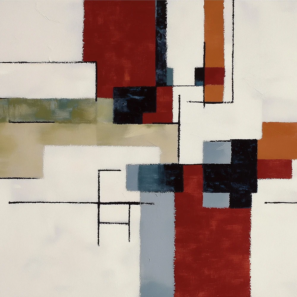
Linee.
Between sign and surface, the project changes its outfit
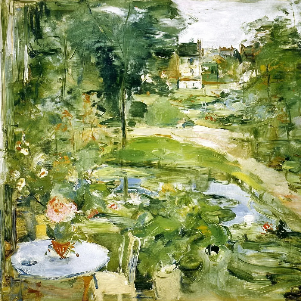
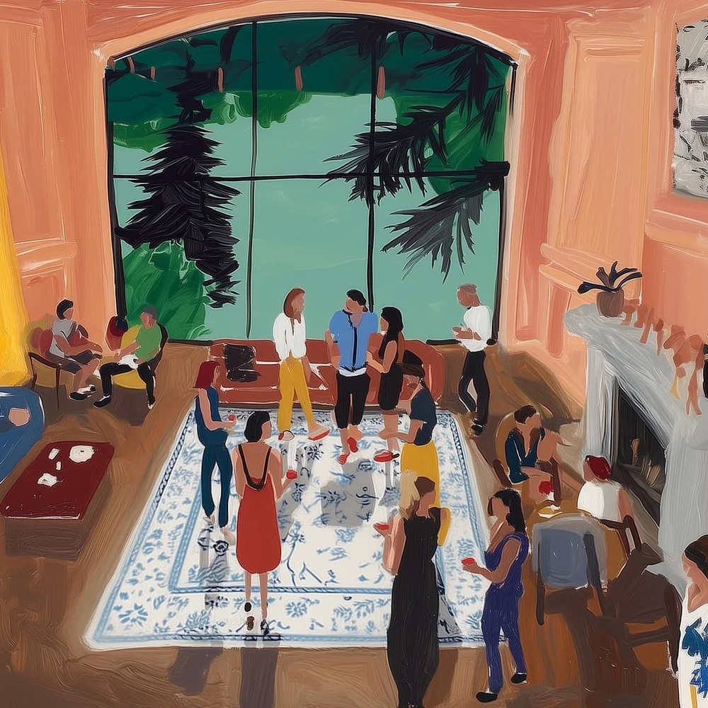
Spazio.
Not a void to fill, but a volume to shape
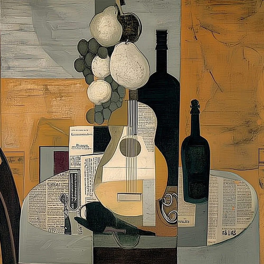
Valore.
Memory and contemporaneity: when the past becomes present
Struttura.
Architecture supporting the harmony of form
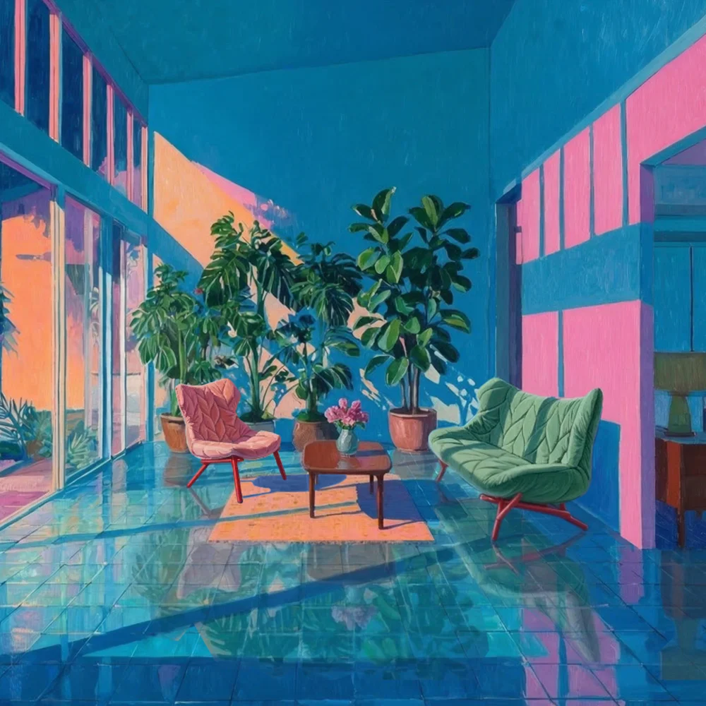
Aria.
The invisible element that gives the project room to breathe
Texture
The tactile signature that transforms the surface
Proporzione
Meeting layers, revealing light
Prospettiva.
The point of view that transforms the object into an experience
Special Project
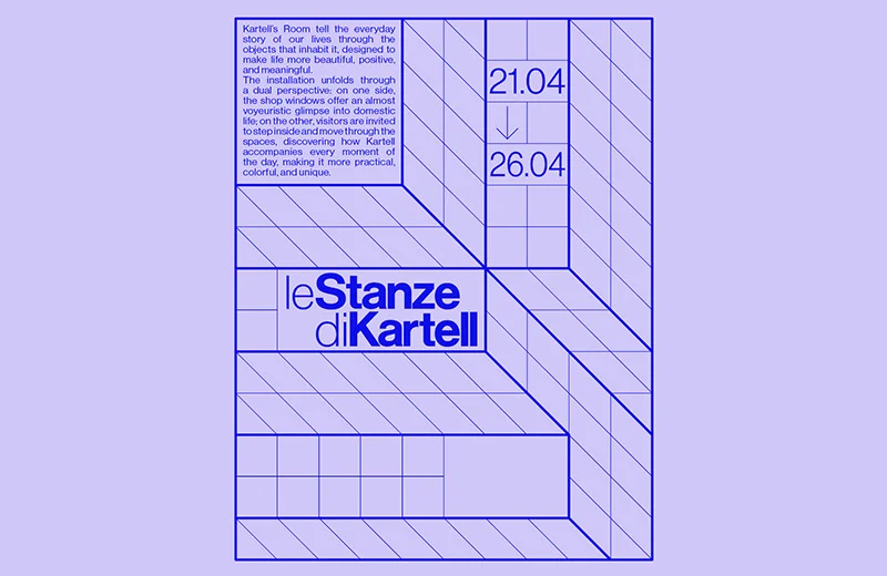
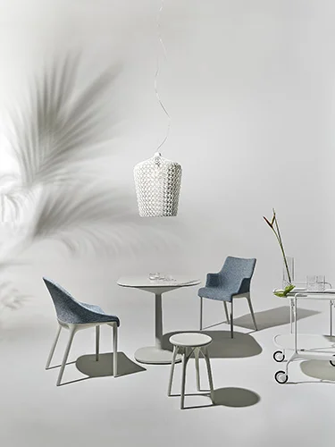
Le stanze di Kartell
@Kartell Milano
Kartell by
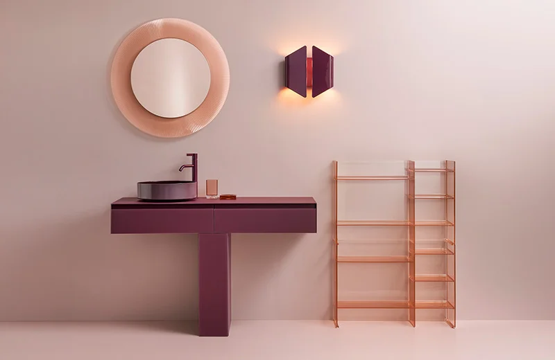
Laufen new collection
@Laufen space